Friday, January 12, 2018

Jim's Lucky Score--the 1846 Levasseur Gironde and Loire

In an earlier post, I explained why I like skulking through antique malls and junk stores for oild maps and prints instead of going to "reputable" professional dealers--the thrill of the hunt is a little sharper. Professional map and print dealers know their business way too well to get a steal, and the really good deals generally outweigh the bad decisions.

I had such an experience recently at the South County Antique Mall on Lemay Ferry in south St. Louis county. Hanging on a wall, between black and white photos of Elvis and Johnny Cash and a framed sports page from the St. Louis Post-Dispatch with the screaming headline "CARDS WIN," I found these two for twenty bucks a pop.


I wasn't sure what I had. I just knew they were good, and I snapped them both up and ran home to look them up. 

As it turns out, they are maps of the Gironde and the Loire from the Atlas National de France Illustre des 86 Departements et des Possessions de France, which was published in at least two editions, 1846 and 1856 under the direction of an artist and cartographer named Victor Levasseur, engraved by A.M. Perrot working off illustrations provided by Raymond Bonheur, and published by Laguillermie & Renaud of Paris.

What strikes me most about these maps is their uselessness.

I don't mean to denigrate them. From what I can tell, they are superbly accurate and detailed. But what arrests the eye isn't the map itself--it's the decorative borders. In fact, the borders are so decorative that you begin to wonder whether they're decorate at all, or if they're not the main focus of the piece. The maps themselves are tucked cozily into the middle of the prints, almost as an afterthought. These maps weren't meant to be used for getting around France by train or carriage or bicycle. They exist to be looked at.

And you could look at them for hours. In addition to the map, there's a wealth of other information packed into these things:


Images of regional heroes, like Montaigne and Vernet (this last was particularly fun for me. Sherlock Holmes, in "The Greek Interpreter," mentions offhandedly to Watson that "my grandmother was the sister of Vernet, the French painter. Art in the blood is liable to take the strangest forms," and so here, tucked away on my map of the Loire, is the Great Detective's great-uncle)... 


Lists of celebrities and other noteworthy people from the region, lists and descriptions of their sites of interest, agricultural and industrial output... 


Scenes of the region and its cities (apparently stilt-walking was popular at the harbor in whatever coastal city this scene depicts)...

Statistics like population, economic data, and other vital information...

Agricultural and industrial products...


Even pathos, as this little goat grazes among the forlorn ruins of abandoned castles.

No, these maps served no utilitarian purpose--at least not the traditional purpose served by maps, which is showing you how to get from one place to another. Educational? Perhaps... there's certainly a lot of information there, and reading every map in the book would have provided at least a thumbnail sketch of the 86 "departements," or administrative districts, that constitute France--but any almanac of the time would have given you much more useful information than the Atlas Illustre would have.

But I don't believe they were purely decorative, either. I think there's another, more deeply embedded purpose to them.

These and the other maps in the book are a celebration of France--her personalities, the richness of her lands, the beauty of her cities and landscape, the accomplishments of her people. There is an unmistakably Gallic joie de vivre and amour de la patrie about them. These maps are an exercise in French patriotism.

Which is understandable, given the context of the times. The 1840's and 1850's were a time of tremendous upheaval and instability in France. The reign of Louis Philippe, the "Citizen King," had been marked by crop failures, economic anxiety, violent uprisings, attempted assassinations, and severe curtailings of liberties and political repression. The Revolution of 1848 ended the reign of Louis Philippe and ushered in the Second Republic, which was soon done away with by the election of Louis Napoleon, the nephew of Bonaparte, who instituted authoritarian rule, arrested his enemies, and established the Second Empire.

In difficult and turbulent times, it must have been comforting to turn to a book that extolled the country, celebrated her past and present glories, and that reassured the beleaguered people of France that, no matter what else happens, we are still French... and France is still France.


Monday, January 8, 2018

Costumes and Color

I recently ran across an absolutely gorgeous and fascinating piece in one of St. Louis's many antique malls. I wasn't exactly sure what it was--it came mounted on foam-board and shrink-wrapped, so I didn't really have the chance to examine it before I bought it, but it was so vivid, so bright, that it immediately grabbed my eye, so I bought it.


It was entitled, "Oceanie," and the tiny legends at the base informed me that it was lithographed by someone named Nordmann, and published by a firm named Firmin Didot Et Cie. That gave me a lot to go on. It had, at one point, been a two-page spread in a book--that was obvious, as it had been folded in half, and the binding remained stuck to the back along the fold-seam--and had quite obviously been published by a French firm. With all that to go on, it didn't take long to track down the piece's story, and it's fascinating for two reasons--its content, and its nature.

"Oceanie" is a page from a six-volume book by an artist named Auguste Racinet called "Le Costume Historique." Published over twelve years, from 1876 to 1888, it attempted to chronicle the entire history of human clothing across the entire world. Racinet, who drew the pictures, worked with dozens of different lithographers, including F.G. Nordmann, a Swede.

You have to love the French, and these pages, while depicting the costume of the indigenous people of the South Pacific, simply drip with Gallic sensibilities. "L'audace, l'audace, toujours l'audace," Danton said, and Le Costume Historique was nothing if not audacious--who but the French would attempt a visual history of everything everyone had ever worn?

And the figures reveal French sensuousness and attention to form. They're beautiful, the people in this print--the figure of the woman near the bottom with the papoose on her back, holding her baby as she cocks her head to kiss him has a sort of subtle eroticism about her, the way her skirt drapes her hips, her ironic stance, the curves of her body, the rondure of her calves, even the insouciance of her ponytail. I think we can be glad it was a French artist who attempted this project.

"Oceanie" and the other illustrations in Le Costume Historique are chromolithographs, Lithography, by the time Le Costume Historique was published, had been around for a while, having been invented by the German printer Alois Senefelder in the 18th century. It involves drawing with a greasy crayon on a matrix made of stone (thus "lithography"--stone-writing). The matrix is then rubbed with a gum arabic solution, and then the image is inked with oil-based transfer ink, and pressed.

Chromolithography takes the process one step further. One can do limited colors on a lithograph, but with chromolithographs, each color-patch gets its own matrix, and the colors are then pressed onto the paper in layers. The result is an almost unlimited potential for color, and when you hold "Oceanie" under the light, you can see how the layers of color were applied--first the tans of the skin-tones, then the gold, then the oranges, then the shadow-tones for shading.

"Oceanie" fits my collecting scheme, if I stretch the parameters a bit, insofar as it depicts the people of a faraway and exotic place--it's the kind of thing an explorer, as well as a historian of dress, might have sketched, and doubtless it transported its readers the same way travel-prints did. But even if it didn't, I'd still be glad to own the piece. Its vibrancy, its colors, the arrangement of the figures on the pages all combine to form a uniquely compelling image, the kind of thing your eye would be drawn to even if you don't give a damn about clothes. 

Sunday, January 7, 2018

Connections and Acquaintances

Part of the fun of collecting antique prints is that you start to run into familiar people. This shouldn't be too surprising. If you concentrate on certain kinds of prints (I like scenes of cities on the water, whether river-cities or port cities) from a certain era (like the 19th century), this limits the field quite a bit, and you're bound to encounter artists whose work you already know.

The same thing happens off the printed page as well. Print fanciers and collectors make up a pretty small part of the population, and you can't help but make connections, particularly if you live in a city like St. Louis, which, its 2.7 million-strong population aside, can sometimes act more like a small town than a major metropolitan area.

One of my favorite recent acquaintances is a woman named Tina Crist, whose business, Art and Frame Restoration on Watson Road in St. Louis, is only a ten-minute drive from my house. I had some pieces which were badly in need of restoration, found her website, and read that she'd worked with the late Sidney Larson, who had restored the Thomas Hart Benton murals in Missouri's state capitol in Jefferson City.

That was good enough for me, because I'd known Sid Larson as a child. Sid was a good friend of my grandfather, who was close to Thomas Hart Benton himself. Grandpa, in contract to my low-down, dilettantish ways, was a serious art collector. In addition to lots and lots of Bentons, he also collected the work of the great St. Louis-born cowboy artist, Charlie Russell, as well as George Caleb Bingham, Oscar Berninghaus, John Sloan, and any number of other American regionalists and Western artists, and he'd gotten to know Sid through their involvement in the art world. The fact that Tina had worked with Sid Larson was a pretty good recommendation. Connection Number One.

Tina is a bubbly, voluble woman whose enthusiasm for her work is endearing and infectious. She insisted that I tour her facility, take a look at what she was working on and how she did it, and then sit down and talk and talk and talk about prints, printmaking, and art in general. I was happy to do it, and happy to leave my prints in her care. She does great work.

Not long after I met her, she texted me a photo of three small prints.


"A gentleman I know has these, and he's looking to move them along," she said. "They're lower end, but I thought you might like them, since they came from a book. You can see the binding stitch-holes at the base. Why don't you give him a call?"


So there was Connection Number Two--a friend of a friend.

Finden's engraving of Yarmouth, after Bartlett's sketch. 
When I looked up "W. Westall, ARA," I got excited. They were indeed from a book: The Landscape Album, Or Great Britain Illustrated: A Series of Original Views, from Drawings by William Westall, ARA, Engraved By, and Under the Direction Of, Edward Finden With Descriptions By Thomas Moule (Charles Tilt, Fleet Street, 1830).

Part of the fun of collecting antique prints is the names of the books from which they often come.

What excited me most was that I knew who both Edward Finden and Thomas Moule were. In fact, I already had pieces by both of them in my collection.

Another connection.

Edward Finden (1791-1857) was one of the most prolific British engravers of the first half of the 19th century, as well as one of the most respected, as shown by his directorship of Great Britain Illustrated. He had worked on many other books as well, including Finden's Views of the Ports, Harbours, Watering Places, and Coastal Scenery of Great Britain (1840, Geo. Virtue). Finden's engravings for that book were based on original sketches by none other than William Henry Bartlett, whom we've met in an earlier post and whom we'll encounter again. And I'd bought one of the steel engravings from that book years earlier: "Great Yarmouth, Norfolk."

Thomas Moule (1784-1851), who wrote the descriptions of Finden's and Westall's scenes, was an English antiquarian, postal inspector, and mapmaker and no slouch at engraving himself. He was also a big fan of heraldry, and liked to festoon his maps with the crests of all the towns and cities in the region he was mapping. And, by a strange coincidence, I'd bought one of his maps just a few weeks before--this one, as a matter of fact. "Dorsetshire," which had first appeared in Barclay's Complete and Universal English Dictionary (1840, published by the same George Virtue who'd published Finden's Views and other books which I have pieces of).


Antique map of Dorsetshire by Thomas Moule

Interestingly, the book was reissued after the railroads had been built, so Moule just pulled out his old plates and scratched the railroad lines into the matrices. The one I have is one of the later ones with the railroad--it's that thick black line curving over the right-hand side of the map.

And it turns out that one of Thomas Moule's descendants is a Facebook friend of mine. Yet another connection.

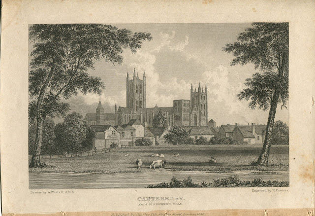
With this swirling maelstrom of connections, I felt like I really didn't have any choice. I called Tina's acquaintance and bought his three prints that same evening. And, all the connections aside, I'm glad I did, because they're really lovely little pieces. Here's Canterbury:


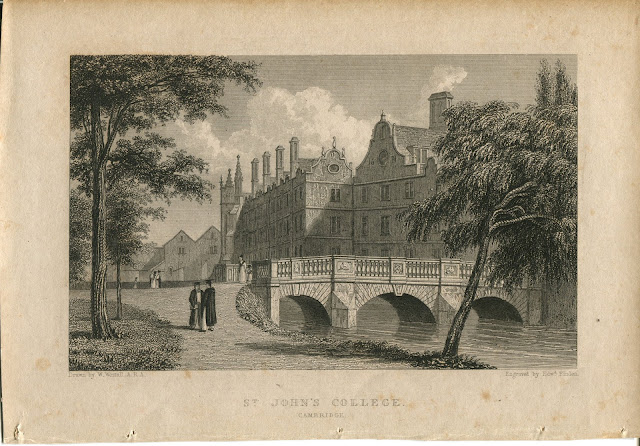
...and here's St. John's College, Cambridge:


...and here's Salford, my favorite of the three, since it has a river in it:


Funny chain of coincidences and connections, in both the 19th century and the 21st. But that's part of the fun of collecting antique maps and prints. You never know who you're going to run into next... and you may well already know them.


The Curious Case of the Payne Print That Wasn't.

I recently came across an interesting little piece at the Big Bend Antique Mall in St. Louis, a place where I've had some good luck from time to time. It's catch as catch can at places like that--sometimes you hit it, and sometimes you don't. I prefer doing my hunting at antique shops and antique malls rather than going to dealers or specialists in maps and prints for a very simple reason: it's cheaper. Lots of times, the dealers at antique malls have no idea what they have, and are willing to let good pieces go for a song.

This cuts both ways. Sometimes, in their ignorance of what they have, they'll pass off a photoreproduction as the real thing, or as a lot more valuable than it is, and so you'll buy it, and only when you get home and look at your find under a magnifying glass, you realize you've got something that's worthless save as decorative. I've been rooked more than once. But I'm arrogant enough to think I'm smart enough to know the wheat from the chaff, so I don't see myself altering my buying habits any time soon.

At any rate, I found a set of six prints of views of German cities. I'm not generally a big fan of Germany or the Germans, but as they fit with my general collecting pattern--scenes of faraway places, views of cities, and scenes of ports and ships--I bought three of them and scuttled home to hit the Googles and see what I could find out.

The first was a view of the river Weser running through Bremen. Once I got it out of its frame, I saw that it was pretty beat up. At some point, it's going to need some restoration, a process about which I'll say more later on.


"Bremen" is uncredited on the print--there's no way to see who did it (it does have the name of the publisher--Kunstverlags in Schweinfurt, which I guess translates to "Art Publishers of Schweinfurt). Unlike the Brits and the Yanks, who apparently liked to have their names slathered across everything they did, German engravers seemed content to work anonymously. I have another German print, this one of Freiburg im Breisgau, which is similarly uncredited. Which is too bad, because I think the work on this little piece is splendid, and I'd like to know more about it.

The second was a scene of the waterfront of Bremerhaven. It was published in 1841, and while I haven't been able yet to find out much more about it, at least it did have the names of its creators on it. It was drawn by someone named Sander and engraved by an A.H. Payne. Sander and Payne apparently worked together--there are any number of views of German cities drawn by Sander and engraved by Payne out there. Here it is.


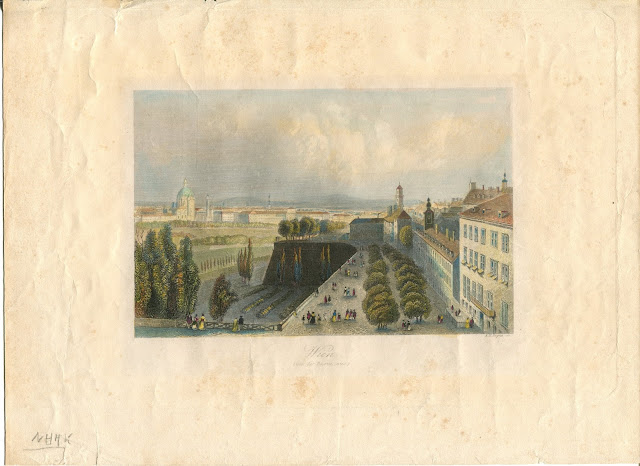
The third one, Wien--or Vienna--from the bastions, was also engraved by this same A.H. Payne.


Part of the fun of collecting and studying antique prints is learning the technical terminology. Like any other profession, art has its jargon, too.


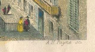
The "SC" following Payne's name is an abbreviation of "Sculptor." In the context of the print world, "Sculptor" doesn't mean someone who works with clay or marble. It's how continental Europeans (including Germans) refer to the engraver (in the English-speaking world, the name of the engraver is often followed by "engr." "Del.", on the other hand, is an abbreviation of "delineator," or artist--the guy who drew or painted the original image).

"Payne" is not a German name, so that was interesting in and of itself. His Wikipedia entry is pretty abrupt, but it did tell me that Albert Henry Payne (1812-1902) was an Englishman who was born in London, but who moved to Germany in 1839 and spent the rest of his life in Leipzig. He may have spent the rest of his life in Germany, but unlike his German colleagues, Payne seemed to have wanted his name on his work.

But I wanted to know more--like, for example, the value--so I did a little more searching around on the Internet. Sometimes, the best thing to do is to type a few keywords into Google Images, which is what I did.

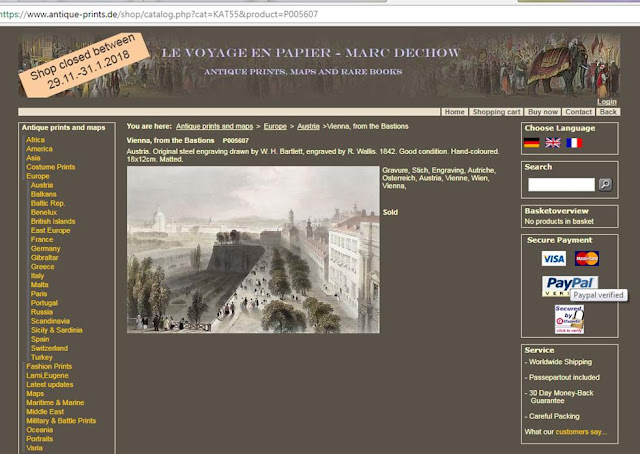
On a German print dealer's site, antique-prints.de, I thought I'd found it. It sure looked like the one I'd bought. The piece had been sold, and the price was not listed, so I struck out there. But there was something else interesting. According to the dealer, Payne had nothing to do with this. The dealer ascribed the drawing to W.H. Bartlett, and the engraving to an R. Wallis.


Now that was interesting. My "Wien auf die Bastei," or "Vienna from the Bastions," clearly stated that it was the work of A.H. Payne, but this dealer said otherwise. And while I can fault the Germans for other things, they tend to be sticklers for details. It was unlikely that this dealer--a reputable one--had made a mistake in attribution.

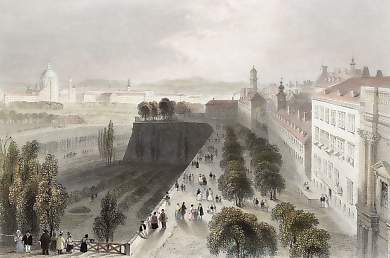
When I examined them closely, side by side, I realized that they were not the same print. Eerily similar though they were, there were, in fact, subtle differences. Here's a closeup of Bartlett and Wallis's Wien:


You'll notice that the differences are subtle, but there. They differ in the placement of the people, the composition of the trees, and the fact that you can see the edge of what looks like a palace in the right-hand side, a detail missing from the Payne piece.

Now, as it happens, I know who W.H. Bartlett was. In fact, I have two of his prints, which I'll talk about in a later post. William Henry Bartlett had more in common with Albert Henry Payne than a middle name. Bartlett was, like Payne, an Englishman, an illustrator and engraver, and an accomplished traveler. He visited the United States in the 1830's and did a series of sketches which were then engraved, printed, and published in book form by Geo. Virtue, a well-known British publisher, as American Scenery, or Land, Lake, and River: Illustrations of Transatlantic Nature. He was a contemporary of Payne's, but he didn't live nearly as long--he died in 1854.

Judging by his Wikipedia entry, he was also a better-regarded artist. He is described as "one of the foremost illustrators of topography of his generation," and has a much longer entry than Payne does. Most likely, he was more highly praised in his lifetime, as well (or perhaps he's just better known to Anglophone audiences, working as he did in England and the U.S., while Payne lived and worked in Germany).

The similarity of the two engravings was striking--so striking that I didn't see how it could be a coincidence. Was it a case of professional rivalry? Artists are famous for being jealous and competitive--were Payne and Bartlett competing to see who could do a better scene of Vienna from the Bastions?

Or is there another explanation?

Clearly, Payne was the engraver, but neither Sander nor any other artist, or "delineator," is named on the print, which could suggest he'd done both--but the pieces' similarity makes it seem probable that Payne copied Bartlett and Wallis, changing just enough of the details so that it didn't look like too slavish an imitation. Considering that Bartlett was the better-known artist, Payne may well have done so.

Or who knows? Perhaps it was pure coincidence. Perhaps both Payne and Bartlett happened to be in the same place and both thought that the view of Vienna from the bastions was worth capturing.

In any case, it's an interesting little mystery. I have not, as yet, been able to ascertain whether these engravings were part of a book or issued singly--finding that out might shed a little light on the curious case of these suspiciously similar views of Vienna. But I'll keep digging, and if I find anything out, I'll update this post.

The Indian Question

Stephen Foutch, of the University of Dallas, calls printmaking "a democratic art form," meaning that, by their very nature, prints were meant to be seen by large numbers of people. Prints, unlike paintings or sculptures, which are unique, are, by definition, copies. The ability to mass-produce them allows them to reach huge audiences.

In the late 18th and early 20th centuries, improvements in the production of steel enlarged the audience for prints even further. This may seem like a non sequitur, but here's how.

Engraving is part of a family of printmaking methods called intaglio printing. A flat surface--like a metal plate--is incised, or engraved, with a sharp instrument called a burin. The metal plate is then covered with ink and wiped clean, but the ink remains in the lines which the engraver scratched into the plate with the burin. The plate is then pressed onto paper, and hey presto--there's an image.

Until the turn of the 18th century, most engravings were made with copper plates, but copper is a soft metal, and the pressure of smashing the plate onto the paper inevitably wore down the plates, so that later impressions are noticeably fuzzier and blurrier than the earlier ones.

Steel, however, changed that. Steel, a much harder metal, allows for inestimably greater numbers of prints to be made from the same plate (or, in printing technology, a matrix). Steel matrices last much longer than copper ones--a printer can use a steel plate more or less in perpetuity without sacrificing the clarity of the image, vastly increasing the numbers of prints which can be made from one matrix.

Steel engravings, to my eye at least, also allow for much finer lines and far greater intricacy of image. They're gorgeous to look at, and the closer you look, the more gorgeous they get. But that's an aside. The heck with the aesthetics. Back to the main point.

Steel engravings, by virtue of the ability they gave to their creators to make more of them, could thus be disseminated far more widely and thus be seen by many more people. Suddenly, art was accessible not merely to the patrons of museums and guests in private homes. It could be mass produced and distributed nationally--a democratic art form indeed.

Prints are, thus, valuable historical documents in addition to being works of art. They show not only what the world looked like to the artist--they show how vast numbers of people saw the world. Prints and printmakers helped shape the perceptions of their audiences of the world they lived in and the history of their countries.

Which is why I find prints depicting Indians--and other people of color--fascinating. I'd like to consider this set of four that I bought at The Emporium in St. Louis in 2017.

This engraving, "Incident at Cherry Valley--The Fate of Jane Wells" (1856--engraved by Thomas Phillibrown, after the original painting by Alonzo Chappel, Martin, Johnson & Co.), depicts a scene from the Revolutionary War: the Cherry Valley Massacre, when a mixed expeditionary force of Loyalists, Seneca and Mohawks attacked the village of Cherry Valley in eastern New York state, and slaughtered the inhabitants.

It would not be the last time that American Indians, angered by their treatment at the hands of the American government, would make common cause with its enemies.

The depiction of the Indian warrior in this print is both interesting and telling. His eyes are wide and staring, but curiously devoid of any expression. They're bestial. It's the kind of look you see in the eyes of a shark--no emotion, just the visual tools of a killing machine. His other facial features--particularly his lips--remind one of the contemporary depictions of African-Americans, as does his skin tone (perhaps we shouldn't read too much of the artists' intent from the skin tone--steel engravings were generally issued in black and white, with color was added later, often by well-bred ladies practicing their watercolor chops. Prints were the adult coloring-books of their day).

Compare the "Incident at Cherry Valley" with this engraving, "The Landing of Roger Williams," also published by Martin, Johnson & Co., and also based on an original by Alonzo Chappel (engraved by George Hall, though, not Phillibrown).

In this scene--I believe a depiction of Williams meeting the Narragansetts, with whom he formed a close bond--the Indians have stereotypically European features and strike recognizably European poses. They could have danced right off a Greek frieze into the Rhode Island wilderness, as they offer the respected Puritan divine Williams the ceremonial peace-pipe and a big basket of nice ripe pumpkins.

Not too dissimilar is this depiction of "The Landing of Hendrick Hudson" (also published by Martin, Johnson & Co. in 1857, based on an original painting by R. W. Weir). The Indians are a little farther away, but you can still make out their European features and poses, as they stare at the spectacle of their fellow Indians hauling Hudson and his men--conquering overlords waving banners, blowing trumpets, and brandishing their plumed hats--ashore.


Finally, there's this piece, the last of the four I bought: "Decatur's Conflict with the Algerines at Tripoli, Reuben James Interposing His Head To Save The Life of His Commander."


This one was also published in 1857, but by Johnson, Fry & Co., also based on a painting by Chappel. It depicts a scene from the Barbary War, and again, the "aggressors," the enemies of the United States, the Barbary Pirates, are hulking, brutish, and recognizably Negroid in feature.

I have not yet been able to ascertain whether these prints were issued and sold singly, or as a set, or as illustrations in a book. I'll keep looking. A little detective work ought to bring out their story. But I do find these pictures interesting, and, in the context of the years in which they were published--1856-57--suggestive. The United States was on the brink of both civil war and the Indian Wars. Good Indians--those on the side of the federal government--looked like Europeans. The bad guys looked like beastlike caricatures of black people. They, and many other images like them, helped shape the public perceptions of Indians.

My hero, Joseph Pulitzer, once wrote, "Publicity, publicity, publicity is the greatest moral factor and force in our public life." He who shapes and controls public opinion controls the nation. In prints like these, we see not only how Indians were viewed by the artists--we see what hundreds of thousands of Americans were being told about them.

Setting Sail.


Last year, I began collecting antique maps and prints.

This happened purely by accident. I'd recently gotten a new job, and wanted to decorate my office. It was a good job, a fresh beginning, rife with possibility and potential, and I wanted my office to reflect the optimism I felt about this new chapter in my career. I wanted it to express themes that I find inspiring: adventure, exploration, discovery, travel.

I've always loved books on adventure and exploration--the Horatio Hornblower novels of C.F. Forrester,  the Flashman novels of George MacDonald Frasier, the Allan Quatermain novels of H. Ryder Haggard. There's something about the spirit of discovery and adventure in the 18th and 19th centuries that I find magical. So I wanted my office to be evocative of this period, and the spirit of those adventures--seafaring, swashbuckling, fearless, insatiably curious. 


Here are some random photos that show the elements that I thought best expressed what I was going for: old trunks, sextants and compasses, ships and ships' lamps, books and graphic novels... even a gar's skull that I found on the concrete causeway leading to Howell Island in the Missouri River. 

But what's more evocative of travel and adventure in bygone days than old maps and globes? They carry with them the spirit of an age when not everything was known, when there was yet more to discover, when the idea of sea monsters lurking in unexplored oceans was still one that might be entertained seriously.

So I began to haunt the antique malls and galleries of my hometown of St. Louis, hoping to find old maps and images of ships and sailing. And I got lucky.


In one such place--the General Grant Antique Mall on Watson Road in St. Louis--I came across this set of four aquatint engravings of nautical scenes. I'll have more to say about these gorgeous little pieces later, but I fell in love with them immediately, and bought them all on the spot (didn't hurt that the dealer only wanted ten dollars apiece). I took them home and immediately started Googling them to find out what I had. And from that moment, I was hooked.

In some ways, it was a pretty natural obsession for me--I've always loved illustrations, illustrated books, comics and graphic novels, and I draw cartoons myself (you can see them at my other blog, Tales of Palmerwood, here)--and I'm surprised sometimes that it took me until the age of 46 to start collecting maps and prints. It's great fun. In addition to enjoying the beauty of the pieces themselves, there's the intoxication of the hunt itself, finding undervalued treasures hiding amongst the tchotchkes and junk of unwary antique-dealers' booths; the researching of the histories and contexts and backstories of the pieces; and the joy of displaying them.

This isn't going to be an academic blog, or even a particularly educational one. There are plenty of excellent resources on the web about prints, their history, the process of making them, and the niceties of collecting them, and one of the best is this one, by the excellent Christopher Lane of the Philadelphia Print Shop.

This is, instead, going to be a kind of personal journal--an explorer's log, if you will--of my own process of finding prints, the chronicle of my own journey of exploration into the fascinating (and sometimes esoteric) world of old images and the people who love them. Along the way, I'll tell you what I've learned from researching them, include some ruminations and reflections inspired by them, and keep you up to date on what I've found--a sort of informal online inventory as well.

And by the way, my office is looking pretty darn swell these days, too.